
Extend your stay to study
Immigration, Refugee & Citizenship Canada
Immigration, Refugee & Citizenship Canada, like many departments in the federal government, are undergoing modernization. Dated systems and a reliance on paper applications left the department with extensive backlogs after a series of world crises - Afghanistan, COVID, and Ukraine.
The Digital Journey Labs were created to try and challenge the department with a new way of working. Each small agile, lab would immerse itself in an immigration journey, identify opportunities and plan a roadmap to improving the experience for the applicant.
As the Design lead, my responsibilities included: Work closely with the Journey owner and Technical lead to craft the vision and roadmap for the study permit lab
Build relationships with internal stakeholders. Plan and facilitate internal workshops to align business interests, values and areas for opportunity
Create a research strategy - Set a plan for how to understand the journey and validate possible solutions
Lead design - concept and wireframe development as well as visual design and asset design
Delivering an accessible solution to WCAG 2.1 AA standards - including guidance and support for development and QA
Mentor and support career growth for junior designers
Study permit 101: Casting a wide net
The eClaims service has been available to practitioners for 9 years. Regular check-ins with practitioners told us that, in general, practitioners who use it, are very satisfied with the service.
The real driver for the update was an outdated development stack, a dated visual design that no longer aligned with TELUS brand and no support for accessibility. This was an opportunity to redesign the portal to be flexible enough to support the product roadmap and evolution and support all of our users with an accessible solution. If the portal was going to be updated, this was a good time to assess how efficient the task flows were to ensure practitioners were spending as much time as possible with their clients.
Themes identified during discovery
The main objectives of the redesign

Build a foundation

Design with reusable components

Accessible for all

Designing building blocks
TELUS Health’s disparate products, user bases, and development stacks lead to a lot of inconsistency. The portal redesign and its components will be used as a starting point for a design system for TELUS Health products. The design of eclaims (a service within the portal) is intended to be used as a template for other services as they’re updated or added.
These components were based on Material Design and customized to align with TELUS brand. This allowed for the development team to move quickly.

A portal for everyone
The portal should be available to practitioners, regardless of ability. In order to communicate a consistent and intentional experience for all, we produced wireframes with instructions for assistive devices and screen readers for the developers to implement.
For this project, the internal development team was new to designing for accessibility so the UX designers provided a lot of additional markup, examples, training, and resources to get them started and get everyone on the same page.
Rethinking the task flow
The key task of submitting a claim for an existing client represented the majority of the activity in the portal. In its current state, the workflow was the same long form whether the client was there for the first time or a follow-up. We explored ways to make it even faster for claims to be submitted for existing clients.

Current process with one LONGGGG form

Chunked information in the form for ease of navigating on smaller devices

By separating out the task flow of an existing client (the more common flow) and a new client we were able to find efficiencies.

Heading in the right direction? We made sure to check
Once we felt we had a clean, low-fidelity concept of the key task of claim submission, we scheduled some practitioners to see if they could intuitively and speedily walkthrough it. These sessions were done remotely using zoom conferencing and screen sharing.
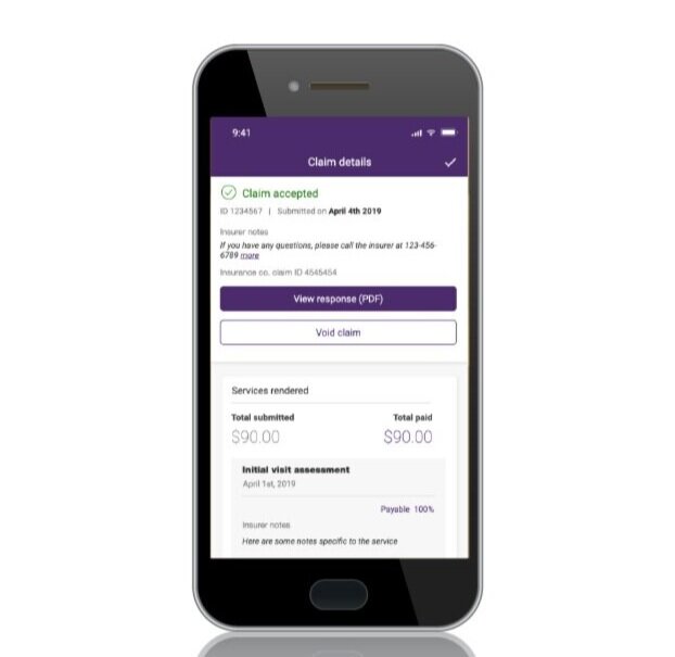
Making claim submission a breeze
Submitting a claim took the forefront of the design, making it as quick and straightforward as possible to zip through claim submission and get a client processed. This could be done from the front desk or sitting next to a client in their home on their mobile device.

All claims
Notifications panel
Claim accepted
New claim workflow - Step 3: Service information
My account menu
Support panel
Not all practitioners have administrators with a waiting room
The majority of eClaims users are administrators who work primarily at a desk. However, some eClaims users are the practitioners themselves - they work independently, sometimes at multiple locations or they’re on the go traveling to clients’ homes.
The mobile app was designed to support the needs of these users - The claim flow is made even more efficient by taking advantage of native features of the device.


Home
Claim accepted

Scan insurance card